Showing posts with label bold strokes. Show all posts

Tuesday, May 10, 2011

"Captive"

Captive , Version 2 ©Beth Stafford 2011

These are color trials for the latest PiCassieO. I titled it "Captive" because it came from a larger print in which the linear forms resembled a bird or butterfly caught between two vertical strips of color. My pictures loaded out of sequence (whatever can go wrong, usually does!). Version 1 has lots of cool color with my favorite black lines; in the second one I decided to switch over to a much warmer version that is a little more subdued than other recent work. Version 3 is totally changed: I inverted the image, changed the palette, and then used a filter to "paint" it. Looks like summer to me! Got a favorite? Let me know - I welcome your feedback!

Captive, Version 1 ©Beth Stafford 2011

Captive, Version 3 © Beth Stafford 2011

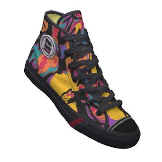
Of course, there's always the possibility that one or more of these will show up on Keds and other cool stuff at our Zazzle store, so drop by and have a look! Prints are always available on request if they aren't yet listed in my Etsy store or website- contact me.

Monday, April 18, 2011

"Confetti" - Celebrating Color!


Confetti ©Beth Stafford 2011

Confetti is one of Team PiCassieO's most colorful, joyful prints so far! I have been having so much fun with it - the colors and energy are incredible, and look fabulous on a variety of items in our expanding repetoire on Zazzle and elsewhere. The print was actually "roughed in" over a year ago, but I left it for reasons I've since forgotten (maybe it was just ripening). It was recently rediscovered and reworked, and boom - Confetti appeared! Looks like a party to me! We'll use it to celebrate Cassie's 12th birthday - she was 12 on April 12 - and hope for another good year for my wonderful friend and partner in "PiCassieO". The original print, in a limited edition of 50, is available for $30; inquire through my website.

Here are a few of the cool products on Zazzle that are adorned with Confetti:


Confetti Collectible Mug on Zazzle


Confetti iPad Case on Zazzle


Last but not least- Confetti Pro-Keds Royal Hi on Zazzle


Almost forgot - check out a new link we've listed, for all you big dogs out there! At MammothOutlet.com there are dozens of high quality beds, with special attention to the needs of large breeds like my Airedale Cassie. Nothing like a good comfortable snooze for our fur babies!

Thursday, February 24, 2011

"Line Dance"


Line Dance © Beth Stafford 2011

Line Dance is my latest PiCassieO - to me it looked like a pair of dancers floating against a rainbow of colors. I like it so much that I reformatted it to use in my shoe designs on Zazzle .
Below is a sneak preview of my first Keds for kids featuring Line Dance. There are four other styles available for adults: Pro Keds Royal Hi, Pro Keds Royal Lo, Lace Up, and Mini Slip On.
The art was fun to make, and the shoes are fun to wear! Interested? Go to PiCassieO and check 'em out!

Are you creative? Zazzle is a fun place to use your photos or art on lots of things besides shoes. See for yourself:
Custom T-Shirts

Wednesday, February 16, 2011

's Not Bad!


's Not Bad © Beth Stafford 2011

Don't know why, but these web images always seem to be darker that the original jpeg. I couldn't resist playing with words on the title, since if you've read how these images originate, you know what "medium" Cassie uses. Anyway, the more dignified title is Enigma Variation, since the two central marks are something of an enigma (and I like the music with the same name). The colors of the original are brilliant - not nearly as dark as they appear here.

I think I know what happened just before the marks were made on the door. Cassie and I have both been sneezing a lot lately. Last week she had a really explosive fit, right at the door, and somehow managed to leave a perfect print of her nostrils on it, with a little embellishment...I got a good laugh when I saw it. The background of mats and shadows was perfect for those two dramatic marks. So now you know.

Monday, February 7, 2011

Cabin Fever!


Cabin Fever © Beth Stafford 2011

The title pretty well describes the mood around here - lots of gray, damp weather, and mud everywhere, which limits where Cassie and I can walk (when weather permits). Yesterday I tried to soak up the few hours of sunshine we had, to store it for the week ahead. Feels like the supply is already running out...but at least there is plenty of COLOR in my art to brighten the day! Cabin Fever is the result of Cassie's markings on the storm door during January. I drew over them with the stylus and then used several filters before applying a custom gradient for the color. I've used the gradient before, but the results were a total surprise - I really love the purple and orange and black combo. No subtlety here, for sure!

Wednesday, December 1, 2010

Drifting


Drifting © Beth Stafford 2010

Drifting is yet another composition from the work with the glass brick and Jacob's Weaving. I have had so much fun with the colors and shapes in this one! For LOST fans, the print I started with was called Lost: Jacob's Weaving, because one of Cassie's scribbles looked like an Egyptian hieroglyph similar to those on the tapestry Jacob was working on when MIB disposed of him. Of course it's unrecognizable after being distorted by the wavy glass brick, but it led to a totally different world of work (seems appropriate, after all!)

Another new world for PiCassieO : Custom-made shoes - art for the feet with PiCassieO all over! See them at PiCassieO! These Keds Slip Ons and Lace Ups will stand out in any crowd - outrageously colorful, true to our art. Each pair is custom-made and takes 3-4 weeks. FYI: good idea to try on the style at your favorite shoe store which carries the brand to make sure of your size!


Tuesday, August 24, 2010

Laughing Lion!


Okay, we're a little silly here today (and those titles are still hard to come by), so I give you Laughing Lion, and its relative Laughing Lion 2. These two were almost forgotten, since I have over 1000 photos on my computer (got an auxillary hard drive but am still reluctant to delete anything). After I cleaned the front door last time, Cassie did some serious marks about something out there. On the clean glass they really stood out against the porch background (including the famous milkcan). I love the bright colors in the first one! Couldn't resist calling it Laughing Lion; the marks remind me of something out of Chinese theater. Beats Milk Can August, anyway.


Of course I had to keep experimenting with it; it's amazing how a new color scheme can totally alter the feel of the work. This one is more subdued and dramatic, even though I can still see that happy "lion". I have a backlog of proofing to do, but sooner or later these prints will be available, either here or at our
store (or maybe both).

Comments (in English, please, and relevant to the ART) are welcomed! You can subscribe to this blog in the upper right to get the latest posts (once every week or so - I promise not to flood your inbox).

Monday, August 9, 2010

Back in the Doldrums (Not a Bad Place to Be!)

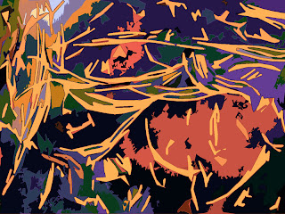
I thought I was working over a new photo of Cassie's marks over the milk can (shows how short my memory is!). When I finished the draw-over and posterization (next photo), it still didn't hit me.

Then I started applying filters and gradients, and it finally did register - this is a continuation of "Midsummer Doldrums": slightly different stroke interpretations and wildly different colors! When I get them proofed and printed the numbers will be in progressive order. This was so much fun, tweaking and changing from one to another! Color is my favorite intoxicant; if they print true, these will have a "wow" factor for sure!


Got a favorite? Let me know - I'd really welcome feedback. Want to subscribe to new blog posts? There's a button in the upper right for that.

After weeks of relative inactivity, due to illness, injury, and the extreme heat, Cassie had a roaring good time at the window today - two deer were moseying across the road to the woods! In spite of the heat, she took off running when we left the porch, all the way down the property to the road. Probably neither of us will be walking well by tonight! It was great to see her enthused again, anyway. And now I have new art to photograph!


Remember to visit our store - a lot of these prints and some gorgeous pendants are for sale there! Our art looks equally great on the wall or on your neck!

Tuesday, July 13, 2010

Midsummer Doldrums

Don't know how it is where you are, but here on the homestead it has been a really miserable summer. The wildlife is hiding from the heat, grass is growing like gangbusters, and the humidity is horrible. Cassie is not a hot-weather dog, so her favorite activity is sleeping, which means the art production is lagging. Nevertheless, she has short bursts of inspiration and I managed to capture some of her recent storm door activity.

This one was tentatively titled Milk Can With Black Strokes (really catchy); in keeping with my post title, I think I like Summer Doldrums #1 better.


Of course, if there was a #1, there is a #2: I applied a different gradient and filter to the original stylus-enhanced photo and this was the result:


And then there's #3: same gradient, different filter.


Looks more like I should title the series Color Riot in the Doldrums!. The next job is getting them to print true, and then they'll be for sale in our store. I had another really nice color variation of #1, but somehow managed to delete it - that never happened with "real" paint. No medium is perfect, I guess - but cyber-color just blows me away!

Got any comments or questions about the work? I'd be glad to hear from you! You can subscribe to our blog in the upper right if you want to be notified of new posts.

Thursday, June 10, 2010

Jacob's Weaving (Still "Lost"!)


OK, I admit it - I'm still hung up on "Lost", and probably will be for some time to come. It's the little "dog god" figure on the right that reminded me of the weaving that Jacob was working on when Ben terminated him. Didn't even notice it when I was working on the print, but when I saw it last night it hit me! Funny how things like that get overlooked sometimes. The original title was "Green Post" - descriptive and boring. This may start a new series, with all the titles having a reference to "Lost". That would be totally fun and really easy, too, because of the incredible and super-abundant details in each episode. LOVE this idea!

My art partner Cassie has been injuring and reinjuring herself for the past three weeks, which is somewhat hampering her ability to "work." She thinks she's still four years old sometimes, and then acts more like fifteen when it catches up with her joints. Neither of us is prone to act our age! Play now, pay later...

Just a reminder: our prints are available in our store or by request. We also have some gorgeous pendants and ACEOs!

Thursday, April 1, 2010

"Lost: Going Home?"

Yep- I admit it, I'm a huge fan of the TV show "Lost" - going to be totally lost without it. It reminds me a lot of the book Masquerade, which was full of clues and hidden meanings to point readers toward a treasure that was actually buried in England. I doubt there's treasure at the end of "Lost" - probably just more questions - but I love the intrigue. When I finished this latest PiCassieO, the background was looking jungle-like, with all these mysterious yellow marks more or less pointing toward the "opening" at the top left. Lost: Going Home? is my self-generated title.

I did go to the"abstract title generator" and got some pretty far-out stuff (like Falling Impressions of Ephemeral Creation) but none of them seem to fit with my art. Guess my own thoughts about a work fit better, even if it's just Storm Door No. 5,647 With Green Stripe.


I welcome your comments about the art! If you would like to subscribe to the posts, please click the button for updates in the upper right of this page.

Saturday, March 20, 2010

One More Time!


"Storm Door April #1" is so bright and colorful - it's one of my favorites. Imagine my dismay when I printed it perfectly and then wrote the WRONG title at the bottom! One thing about that velvety matte paper I love - it is totally unforgiving, especially where pencil marks are concerned. Attempts at erasing only make it smudge worse. Rather than throw away a beautiful print, I decided to offer it as the first Dirt Cheap Deal in our Etsy store. Most of the titles are labels of where and when I did the original photos - as I previously said, I need to work on those titles- and aren't terribly important. I'm offering it for $15 plus $5 S & H - a great deal, especially since it's really one of a kind ( I sincerely hope I don't do that again!).

Comments are welcomed. If you like, you can easily subscribe to our posts by clicking the "Update" button in the upper right. I promise not to flood your inbox!

PS. This post title refers to the fact that the print was posted last year, which I tried to explain in the first paragraph as an afterthought, but was stymied by a pesky period that would not disappear! I could backspace right up to it but it wouldn't be deleted. That's the kind of week it's been - my Face Book page became invisible, and my email was stopped for three days , which in turn created havoc elsewhere. Another week like this and I'm blasting OUT of cyberspace!


Friday, March 5, 2010

March Madness


One of these days I really need to go to a site that generates titles for abstract art - obviously I'm running out of good ideas! This work continues the previous exploration of isolating lines and using pure colors in the background. I also signed it, which is something new. The main reason I added a signature was compositional - it needed the element (IMO) for balance. "Bold and simple" was what I was going for here. Comments welcomed as to whether I made it happen.


Couldn't resist playing a little more with this one - I decided to crop the first one, add more yellow, and see if it still needed that signature. Yep. Vote for your favorite!

I welcome comments (the good, the bad, but please not ugly!) and questions, as long as they relate to content (have been getting some really strange stuff occasionally). You can subscribe to this blog by clicking the button at top right.

And if you're in a shopping mood, check out our store - currently we have 10 prints and some really gorgeous pendants that are tiny abstracts from the art. Don't miss our first "Dirt Cheap Deal" - I goofed when I signed one of the prints and put the wrong title on it. Can't erase on that paper - it's a beautiful print, too good to waste!

Monday, October 26, 2009

Summer Porch

Found a little time to play (work) and Summer Porch was the result. I think the original photo represented a couple of months work at the storm door by Cassie. The colors in this one are incredible! Even though I use a lot of black (traditionally associated with gloom and doom), this is a joyful, energetic work. The black makes the colored areas even more vibrant. It's very hard to judge how anyone sees these on the web - the only way to get the full impact is to actually see the print (done my way!). That means "do not attempt this at home", if you get my drift. Summer Porch will be listed on Etsy by tonight - have a look at PiCassieO . I will offer it as a full-size print and a slightly different version as an ACEO (Artist Card, Edition, or Original) - art to fit all budgets (even mine)! Come visit!

Thursday, October 15, 2009

Walking In the Air


The title Walking In The Air came from a song on a Christmas CD. I liked the way Cassie's marks sort of march across the window in this one, although the colors and feel of it speak more of fall than winter. Right now in NC, it feels more like winter than fall! Wet and nasty for several days now - but Cassie is happy because there was finally a deer in the yard this morning. Now I have some new material to work with at last - we've been having a dry spell artistically (but not weather-wise), due to lack of wildlife. Our quince tree is presently dropping its sour fruit on the ground, so there should be a little more traffic out there soon. How anything can eat that stuff, I don't know. They smell good, but have the effect of green persimmons! Ugh.

Big Announcement: Our Etsy store is up and running! We have a dozen prints for sale, and I'm adding pendants and ACEOs ASAP. In case ACEO doesn't ring a bell, it stands for "Artist Cards, Editions, & Originals". You collect them like trading cards and can house your collection in an album. Really affordable art! Visit PiCassieO often and see what we're offering!

Wednesday, September 23, 2009

West Window September


Cassie made a really wild swoosh on the left window facing west - not her usual spot for viewing, since she prefers sitting on the other end of the couch top. I haven't been able to do much with it until now - just decided to go with dense black strokes and experiment with a new gradient background. Maybe still needs work, but I LIKE the black. It goes back to my student days, when using black paint straight from the tube was frowned upon (my instructors were still hung in NeoImpressionism). Well, I love its absoluteness and strength, and have used it in everything I've done since then - my rebellious streak showing through. I can see some interesting pendant material in this one, too! Be watching at Close Encounters - I'm working on new ones now.

Tuesday, September 15, 2009

Back to Serious Art Here! Scat, Cat!


OK - I was a little late, but the famous pickle recipe is now history. For a refresher course in how the art in this blog starts, check out "PiCassieO at Work" - see Cassie the Crackerdog in action! One of the works in the video is Scat, Cat! This is the updated version, with a new color palette. Funny- I really liked my "Herb" colors (check archives for the Herb series) when I first started using them, but fell out of love with them at some point and am redoing all of the art in that series - artistic evolution at work!

Friday, July 17, 2009

Driveway, July #1

Getting more colorful all the time, here! It's like opening a present, every time I try a different palette! This is a totally new look for "PiCassieO". There's another version coming up in the next post - vote for your favorite!

And don't forget - BIG Anniversary Sale at www.cafepress.com/airedale_art
You won't see these prices again! Still two weeks left - go shopping!

Sunday, May 24, 2009

Milk Can May #2 (I think!)


Help - I just can't stop! There's already a #3, plus the plain old Milk Can that was posted first. This one prints beautifully, as have the others. It's becoming more and more like painting, especially with the "hands-on" involvement that the stylus affords. I salute my new medium! Have to admit, this form of my art is not getting the reception that my earlier paintings did; I'm hoping (and do believe) that attitudes toward "computer art" are changing, and that pretty soon it will be accepted as just another medium of expression. Thoughts on that? or anything else? Let me hear from you!

Cassie is blissfully unaware that a haircut is impending. So far we've had three ticks between us, so the woolly one is going to get buzzed. If you aren't familiar with ticks, I want to move wherever you are! This wet, sticky weather is their favorite, and they're out for blood. Double ugh.

Thursday, May 21, 2009

Milk Can #2


Sometimes my camera just won't focus on Cassie's marks, especially when they've been rubbed a little by her fuzzy head. In this instance it didn't focus on much of anything; you'll just have to take my word for it that there was a milk can in the background. I didn't posterize the photo; instead I just drew over the marks with the stylus and then applied a custom gradient (my current favorite) and this is what happened. The background, which was out of focus, got soft and luminous so the bold black marks seem to float on top. Very satisfying! Milk Can is going to be a loooong series, I think.